The proliferation of mobile phones is changing the face of retail shopping and consumer shopping behavior - making omnichannel the new normal.
While traditional desktop websites still boast higher conversion rates, mobile sites are quickly gaining traction. According to research, 57 percent of all online traffic is generated via mobile phones and smart devices.
With that in mind, the new shift in consumer shopping behavior now calls for retailers to not only to adapt to the shift but to also take it a step further and essentially revolutionize their mobile shopping experience.
In the first quarter of 2018 alone, $236 billion in sales were forgone due to friction in the online checkout process. So, as a retailer, if your website fails to provide a pristine mobile experience, you could not only miss out on potential customers but lose current customers to competitors.
So, what makes for a good or even great mobile experience?
How can you enhance your e-commerce mobile website and increase conversions at checkout?
Does your mobile website check off all the boxes?
- Load Time - Did you know that 53% of mobile users abandon websites that take longer than 3 seconds to load? To remedy your load time, consider Google AMP pages or reach out to your hosting provider to see if they can offer up better mobile responsive solutions.

- Homepage - Is your homepage easy to get back to? Make sure when users click the logo they return back to the homepage. If not, they might get irritated.
- Call-to-actions - Are your CTA’s front and center? Call-to-actions are arguably the most important part of your website. With that, your CTA’s also need to be clear and strong as they help you grab the attention of your customers. Also, be sure to place any secondary CTA’s “below the fold” (the part of the landing page that cannot be seen unless the user scrolls down) or via your menu options.

- Short Menus - Are your menus short and sweet? If not, reorganize your menu to use as few items as possible without sacrificing usability. Mobile users don’t have the tolerance or patience to scroll through a long list of options to find what they want.
- Promotions - While promotions are great, don’t let them destroy the user experience. Full-page promos that hide content underneath, tend to annoy users and make it difficult to perform tasks. In addition to that, interstitials can negatively impact your website search rankings.
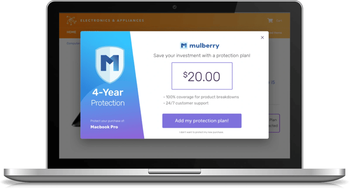
- Maximizing Convenience & Perks - Pre-filled preferences for already registered users can greatly improve conversions. On top of that, offering familiar, third-party checkout services as well as customer incentives such as product protection and free 2-day shipping, can help motivate your buyers.

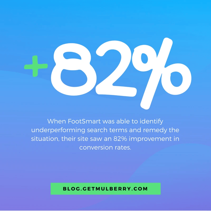
- Site Search - When users need to up information, they usually turn to search. When FootSmart was able to identify underperforming search terms and remedy the situation, their site saw an 82% improvement in conversion rates. With that in mind, make sure your site contains an easy to access search bar and also make sure your product pages and content in general, are tagged and optimized best for search.

- Filters - When there are tons of products available on your site, users expect to use filters to find what they’re looking for. Be sure to place filters above search results and make it’s clear how many results will be returned when a specific filter is applied.
- Conversion - Let users explore before they commit. Avoid having a user signup before they can view the site, especially when the brand was unfamiliar. Although customer information may be an integral part of your business, asking for it too early may result in fewer conversions.
- Guest Experience - Users tend to get annoyed by sites that force them to register for an account when making a purchase. This is especially true when the benefit of an account is unclear. A study found that 30% of users abandoned their carts when asked to sign-up before checkout. With that, allow users to purchase as a guest.
As more people and more people use their phones to make purchases, more and more merchants are optimizing their mobile websites to ensure that they are providing the most convenient shopping experience for both new and returning customers.
What are you doing to optimize your mobile website user experience and checkout conversion? Better yet, what are you doing to eliminate low conversion rates and friction in the shopping process?


